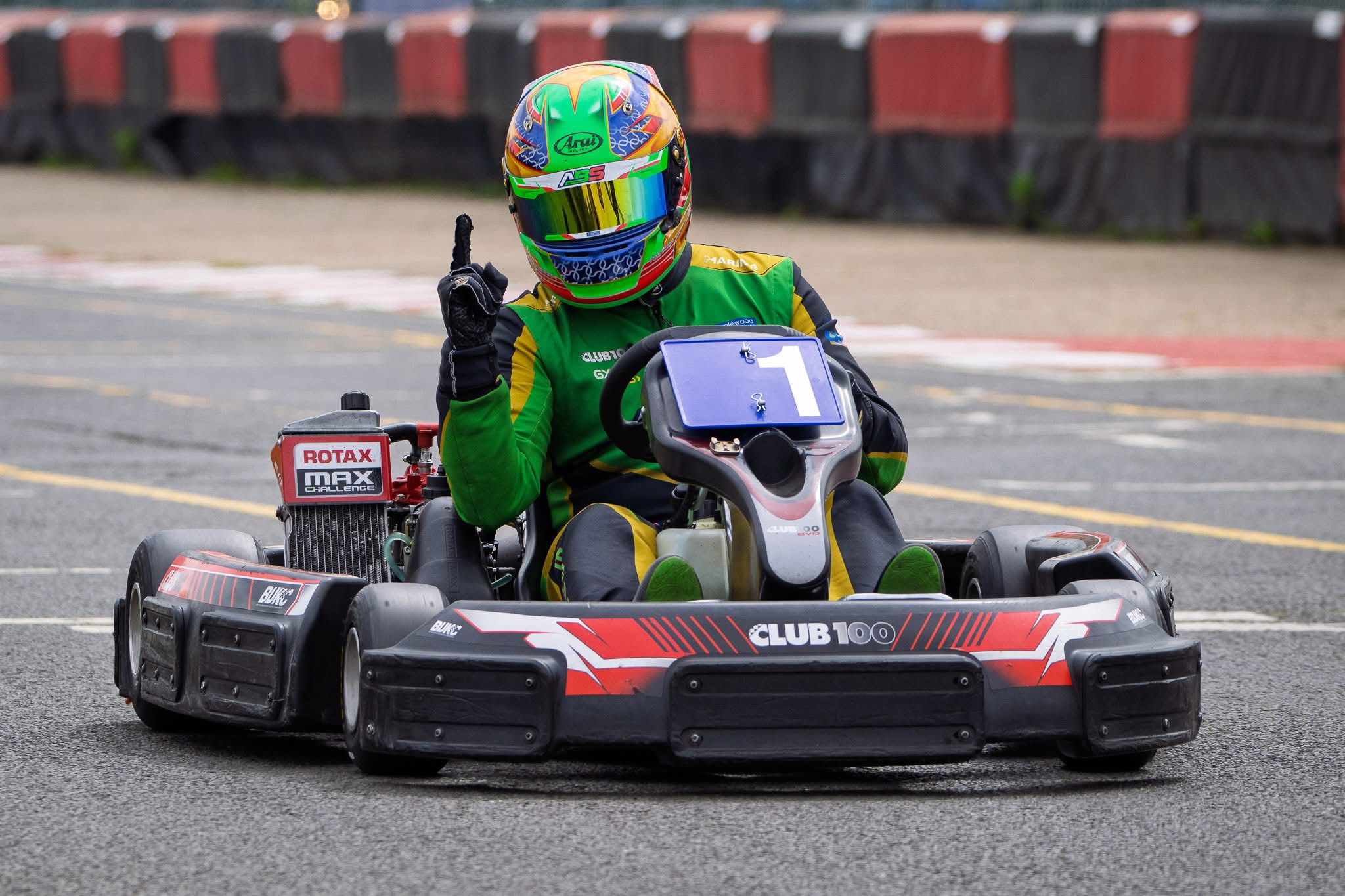
How to Improve Your Lap Times with Data Analysis
Start with sectors, not lap times. Colour-coded sector breakdowns show exactly where you're gaining and losing time. Compare your fastest lap to slower ones using synchronised video and telemetry overlays. Use the perfect lap feature to see how fast you could go. Let AI coaching interpret the data and give you specific, corner-by-corner advice on what to change.
Feel Is Lying to You
Every kart racer has that moment. You come off track absolutely certain you nailed a lap. Best one of the day, no question. Then you check the times and it's two tenths off your fastest.
Or the opposite. A lap that felt scrappy, where you thought you missed the apex at turn 4 and braked too early into the hairpin, turns out to be your quickest of the session.
Feel is unreliable. It has to be. You're processing a hundred inputs per second in the seat, adrenaline is up, and your brain is doing its best to keep up with what's happening at 70mph two inches off the ground. What feels fast isn't always fast. What feels slow isn't always slow.
Data doesn't have this problem. And karting data analysis has become accessible enough that you don't need an engineering degree to use it.
Start With Sectors, Not Lap Times
The first mistake most people make with data analysis is staring at overall lap times. A lap time is the sum of everything you did for that entire lap. It tells you the final result but nothing about what produced it.
Sectors are where the useful information lives. When your track is divided into four, five or six sections, you can see immediately which parts of the circuit are strong and which are costing you. Maybe you're consistently fast through the flowing section but losing three tenths in the tight complex at the back of the track. Or maybe it's the other way round.
Without sector data you'd never know. You'd just see "1:02.3" and wonder where the time went.
On Race Ninja, sectors are colour-coded green and red across your session. Green means that sector was faster than your average. Red means slower. Patterns jump out instantly. If sector 3 is red on every single lap, that's where your time is hiding. You don't need to be a data scientist to see it.
Compare Your Best Lap to Your Worst
This sounds obvious. It isn't.
Most people only look at their fastest lap. But the gap between your best and your fourth or fifth fastest is where the learning happens. Pull up a head-to-head comparison between your quickest lap and one that was half a second slower. Where did the time come from?
Look at the speed traces through each corner. Did you brake earlier on the slower lap? Did you carry less apex speed? Was your throttle application different on the exit? Synchronised video playback shows you exactly what happened. You can see the steering input, the kart attitude, the moment you got on the power. Side by side, the difference becomes obvious in a way it never would from memory alone.
Racing Lines Tell a Story
When you see your racing line plotted on satellite imagery of the circuit, colour-coded by speed, something clicks. You can physically see where you're using all the available track and where you're not. You can see if your line tightens too early through a corner, if you're leaving tarmac on the exit, if your approach angle is costing you on the following straight.
And when you overlay your fastest lap's line against a slower one? The differences are usually smaller than you'd expect. Inches of positioning through one corner that cascade into a speed difference down the next straight. Data makes those inches visible.
Your Perfect Lap Already Exists
Here's something that changes how you think about improvement. Race Ninja builds a "perfect lap" from your session by taking the fastest sector you actually drove in each part of the track and combining them into a single theoretical lap time.
Most drivers find a surprising gap between their best real lap and this theoretical best. Often three or four tenths. Sometimes more. That's not time you need to find through some dramatic driving change. You already drove each of those sectors. You just didn't put them all together on the same lap.
That reframe matters. You're not trying to drive beyond your ability. You're trying to be as consistent as the best version of yourself that already showed up in each section.
Let AI Do the Interpreting
Not everyone has time to sit down and pore over telemetry charts for an hour after each session. Life gets in the way. And honestly, reading speed traces and g-force graphs takes practice. It's a skill in itself.
This is where AI coaching earns its keep. Race Ninja's analysis engine looks at your session data and produces specific feedback for each section of track. Not generic tips. Actual observations about your braking points, corner speed, throttle application and line choice at named corners. It picks up on patterns you might miss, like inconsistency through one particular turn that's costing you time on most laps.
And it's conversational. If the coaching says "you're braking too early into the chicane" and you want to know exactly how much earlier you're braking compared to your fastest lap, you can ask. It'll tell you.
You Don't Need Expensive Hardware
A decade ago, karting data analysis at this level required a dedicated data system costing hundreds of pounds plus a data engineer to interpret it. Professional teams had it. Club racers didn't.
Now? A GoPro and Race Ninja. That's it. Upload your footage, get your sectors, see your racing line, read your coaching. The barrier to data-driven improvement has basically disappeared.
We've processed footage from tracks across 12 countries. Club racers, arrive-and-drive sessions, junior karters with parents trying to help them find time. The data works the same everywhere. The physics don't change.
The Practical Bit
Here's a routine that actually works. After every session, upload your footage. Look at the sector colours first. Find the red ones. Open the head-to-head comparison between your fastest lap and one where those sectors were green. Watch the synchronised video and spot the difference.
Then read the AI coaching. It'll usually confirm what the data shows and add detail you might have missed. Write down one thing to try next session. One thing. Not five.
Improvement is iterative. Good karting data analysis just makes each iteration count.
Frequently Asked Questions
How do I use data to improve my karting lap times?
What is a perfect lap in karting data analysis?
Do I need expensive hardware for karting data analysis?
Step-by-Step Guide
-
1
Upload your session footage
Record your karting session on a GoPro with GPS enabled and upload the video to Race Ninja. Processing takes about 10 minutes.
-
2
Check sector colours
Look at the colour-coded sectors across your session. Green means faster than average, red means slower. Identify which sectors are consistently red.
-
3
Compare laps head-to-head
Open the head-to-head comparison between your fastest lap and one where the weak sectors were stronger. Watch synchronised video and telemetry side by side to spot the differences.
-
4
Read the AI coaching
Review the AI coaching feedback for specific observations about your braking, corner speed, line choice and throttle application at each section of track.
-
5
Focus on one thing
Write down one specific change to try next session. Not five. Improvement is iterative and data makes each iteration count.
0 Comments
Sign in to join the conversation.
Sign InNo comments yet. Be the first to share your thoughts.
More Articles

Where am I losing time? How to find the corners that cost you
Every guide says brake later and hit the apex. None of them tell you which corner is actually costing you. Your own footage does. Here's how to read it and find your next few tenths.

GoPro Hero 11 GPS for racing: the value pick for telemetry
If you want one camera for racing telemetry without spending a lot, the GoPro Hero 11 Black is hard to beat. It has GPS, the data it records is genuinely good, and now that it's a couple of models old you can find it cheap. What GPS the Hero 11 has The Hero 11 introduced a newer...

Does the GoPro Hero 12 have GPS? (and what to do about it)
Straight answer: no. The GoPro Hero 12 Black has no GPS. And unlike a setting you forgot to switch on, there's nothing you can do about it. GoPro took the hardware out. This catches a lot of racers off guard. You upgrade from a Hero 11 expecting more of everything, and your telem...