See where your speed drops at a glance
Race Ninja now shows colour-coded speed zone bars behind each lap on the Overview tab lap time consistency chart. Four zones from slow to fast let you compare speed distribution across your whole session without clicking into individual laps. The legend shows speed ranges in your preferred unit and lap numbers appear on the x-axis for easy reference.
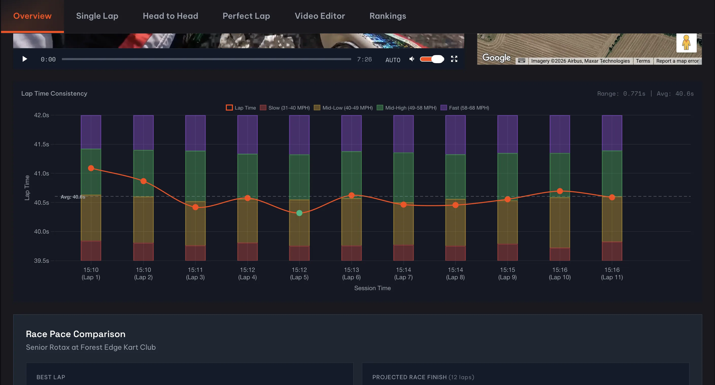
Your Overview tab just got a lot more useful.
The lap time consistency chart now shows stacked speed zone bars behind each lap data point. Four colour-coded zones, from slow (red) through to fast (purple), give you an instant picture of how you spent your time on track during every single lap.
Why does this matter?
Because lap times alone don't tell the full story. Two laps might clock identical times but for completely different reasons. One could have you carrying speed through corners but losing time on the straights. The other might be the opposite. Until now, you'd have to click into each lap individually to compare speed zones. That's tedious when you've got 15 or 20 laps in a session.
Now you can scan the whole session in one view. The bars stack up to show what percentage of each lap you spent in each speed zone, and the legend tells you exactly what speed range each colour represents. It works with whatever unit you prefer too. If you've switched to KPH in your profile, the legend and ranges update automatically.
What else changed
We also added lap numbers under the session timestamps on the x-axis. Sounds like a small thing, but it makes the chart way easier to read. Instead of trying to work out which time maps to which lap, you can just look down and see (Lap 7) right there.
Hover over any data point and the tooltip now includes a speed zone breakdown showing the percentage split across all four zones for that lap. Handy for quick comparisons without leaving the overview.
Try it now
Open any session with more than a couple of laps and scroll down to the Lap Time Consistency chart. The speed zone bars appear automatically once your telemetry data loads. And if you click into the Single Lap tab, you'll see the same colour scheme on the horizontal speed zone bar there, so everything stays consistent.
We've got more chart improvements in the works. But this one felt worth shipping on its own.
Frequently Asked Questions
What are speed zone bars on Race Ninja?
Can I see speed zones in MPH and KPH?
0 Comments
Sign in to join the conversation.
Sign InNo comments yet. Be the first to share your thoughts.
More Articles

Some sessions deserve Pro. Now you can unlock just those
Pick the session that matters and turn on the full Pro toolkit for it, no monthly plan. Unlock a free analysis for £1.99, or pay the 40p difference on one you already funded with Clubman.

Got a question or a lap to show off? Find us on Discord
We've opened a Discord server for Race Ninja. It's where you share your sessions and get help from drivers who actually race.

Your Race Ninja, your way
Race Ninja is your platform, so now it can look like yours. Pick a brand colour in your profile and the whole site wears it, from your dashboard to your lap charts.